

Food safety, Quality assurance and Customer satisfaction are crucial in the food sector. Any failure in food safety, quality, or unsatisfied customer necessitates quick action to figure out what went wrong, why it went wrong, and where it went wrong. All the deviations would need a fix and a detailed study on that, the methodology used to fix it, how to fix it, what to fix and how to prevent it from recurring again, becomes a big exercise. If the root cause of the problem is not identified in detail, one will be solely addressing a symptom, with the problem still continuing to exist. For this reason, Identifying and eliminating the root cause of a problem is of extreme importance. This can be fulfilled by a systematic approach termed Root Cause Analysis (RCA).
The Root Cause Analysis and the Corrective Action to the root cause is a series of procedures followed in a specific order to identify, detect the cause and successfully rectify the issues that have been experienced in any field of manufacturing or servicing systems. RCA must be systematic, and evidence-based based, requires a complete understanding of the food supply chain right from sourcing, characteristics of material, handling, processing, packing, storage, transportation, distribution and final consumption, which covers the whole cycle from farm to plate. To identify the root cause of the problem there are a significant number of tools available, thus choosing the best tool is important and can vary from situation to situation and industry to industry. It may sound simple but is not always simple, therefore, it is important to stress that although tools can be highly useful in the right hands, they can also be quite deterrent in the wrong hands. For this reason, it’s critical to understand which tools are the best for problem-solving, when to utilize them, and how to solve problems during processes of improvement. Different tools can be combined together to complete the investigation and come up with the best results.
Process of Conducting Root Cause Analysis

Fig: Systematic process of conducting root cause analysis
Seven tools were identified by Kaoru Ishikawa in the 1960s, by a Japanese scientist, that every business should use: flowcharts, check sheets, histograms, Pareto diagrams, cause and effect diagrams, scatter diagrams, and control charts. They are also referred to as the seven “old” or “basic” tools. Subsequently, other additional tools were created for different uses, but the 7QC tools served as the foundation for all other tools. Stratification, which some authors have subsequently referred to as a flow chart or a run chart, is one of his original seven techniques.
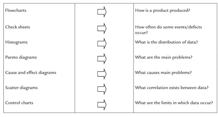
Fig: Presentation of the basic seven tools and answers they give when used properly (Djekic and Tomasevic et al., 2018)
Even though these seven tools are the oldest ones, below are the tools which are currently widely used in the industry.
The 5 Why’s of Root Cause Analysis:

The 5 WHY is a simple problem-solving method to determine the root cause of a problem and implement corrective actions, originated in the Toyota production system by Sakichi Toyoda. This strategy involves repeatedly asking the question “WHY” and drilling down into the root cause of the problem, where usually one question should prompt another “WHY” and the process should go on until the underlying cause of the problem is determined. After the process is finished, a suitable corrective action must be created in order to get rid of the nonconformity’s cause and prevent it from recurring. Both the corrective and preventive activities include removing the root cause of the issue, they only differ in the timing of their implementation. While preventative action aims to remove the problem’s source before it manifests, corrective action is initiated after the problem has happened and its symptoms provide some data that can be used in solving it.
The 5 WHY must be operated in groups involving all team members associated with the process. The limitation of 5 WHY is that it may not always help in identifying the root cause. Thus, this tool is often combined with other quality tools to support investigation.

Fig: Structure of 5 WHY approach, Ershadi Et al.,2018

In a manufacturing plant, a machine unexpectedly stops. The first “Why?” reveals it overheated. The second “Why?” finds a lack of coolant caused the overheating. The third “Why?” shows the coolant wasn’t refilled due to a missed maintenance schedule. The fourth “Why?” reveals that the schedule was missed because the team was understaffed. Finally, the fifth “Why?” identifies budget cuts as the root cause, leading to understaffing, missed maintenance, and machine failure.
Advantages: Easy to use and keeps attention on the one problem.
Disadvantages: This is a time-consuming brainstorming process and results are not consistent
2. Fishbone / Ishikawa diagram / Cause and effect diagrams
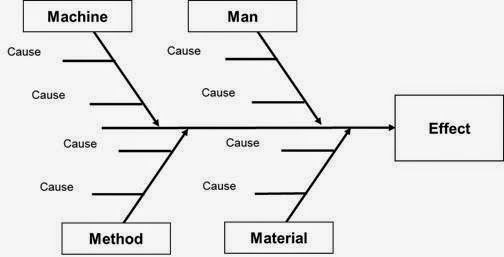
Fig: Generic model of Fish Bone Diagram
Fishbone diagram or Ishikawa diagram is a tool with a graphical-based approach, which explains in detail all possible causes associated with the problem. It was developed in the 1960s by Professor Kaoru Ishikawa. The process starts by addressing the basic problem on the right side of the diagram or on the head of the fishbone skeleton. Then all possible potential causes or factors that influence the problem are represented in the fins and spines. Obtaining multiple possible causes is seen to be crucial because the ones that turn out to be the “correct” ones aren’t always the ones that are easiest to identify. It is crucial to include all possible reasons that can be found as a result.
Once all the possible cases are added, one can start investigating the causes examined with all probability. Usually, Ishikawa diagrams are used jointly with the five whys.
In deciding the factors that can influence the problem, the framework developed by Six Sigma 6Ms is a common approach in manufacturing.
6 Ms (With Example):-
- Man – Human error, Lack of training, Miscommunication
- Machinery – Fault in machine components, Lack of lubrication
- Materials – Fault in RM
- Method – Defective methodology or technique
- Mother Nature – Environmental factors
- Measurement – Calibration problems
Advantages: Helps to visualize all potential causes in one place. All the potential causes are categorized as people, processes, equipment, materials, environment and management.
Disadvantage: As this is a divergent approach to problem-solving, it is time-consuming.
3. Root Cause Analysis using Pareto diagram

A Pareto chart is a graphical tool used to identify the most significant factors contributing to a problem & also gives you a score showing the severity of the problem. It is based on the principle known as the 80/20 rule. This states that 80% of the effects come from 20% of the causes. This method is useful when there are several contributing factors to a problem. To use Pareto Analysis, identify and list problems and their causes. The concept was proposed by renowned Quality Management consultant Joseph Juran, who called it after Italian economist Vilfredo Pareto, who identified the 80/20 relationship in 1896. Gathering data, sorting it from most frequent to least frequent, labelling the axis and plot bars for each issue seen, calculating cumulative values and drawing the cumulative line, and interpreting the data are typical stages in creating a Pareto diagram.
The Pareto Chart is a series of bars whose heights reflect the frequency or impact of problems. On the Chart, bars are arranged in descending order of height from left to right, which means the categories represented by the tall bars on the left are relatively more frequent than those on the right.
Advantage: Easy to understand
Disadvantage: Focusing on the Pareto chart alone may lead to the exclusion from further consideration of minor sources driving defects and non-conformances.
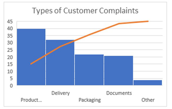
Fig – Generic model of Pareto diagram, Djekic and Tomasevic et al., 2018
4. Scatter Diagram

A scatter diagram also known as a scatter plot graph in which the values of two variables are plotted along two axes, the pattern of the resulting points revealing any correlation present. It is a visual representation of the relationship between two variables. Here the x-axis represents the potential cause and the y-axis represents the effect or outcome. Each data point represents one observation. The closer the dots are to a straight line, the stronger the correlation is between the variables. The slope and direction of the line indicate the type and degree of the relationship: positive, negative, or no correlation. This is commonly used to gain insights into the relationships between variables and for further analysis or decision-making. Used where data is available and measurable.
Advantages: Easy to understand the relationship.
Disadvantages: This is ineffective without sufficient data.
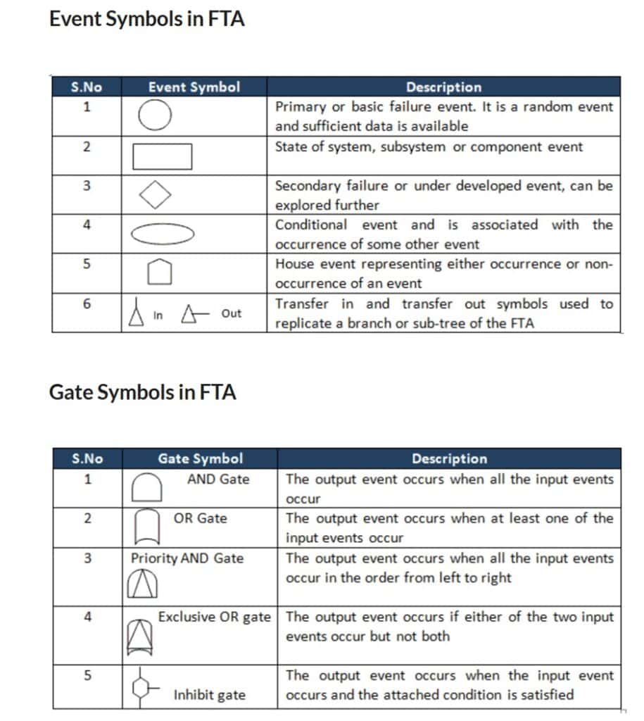
5. Fault tree analysis
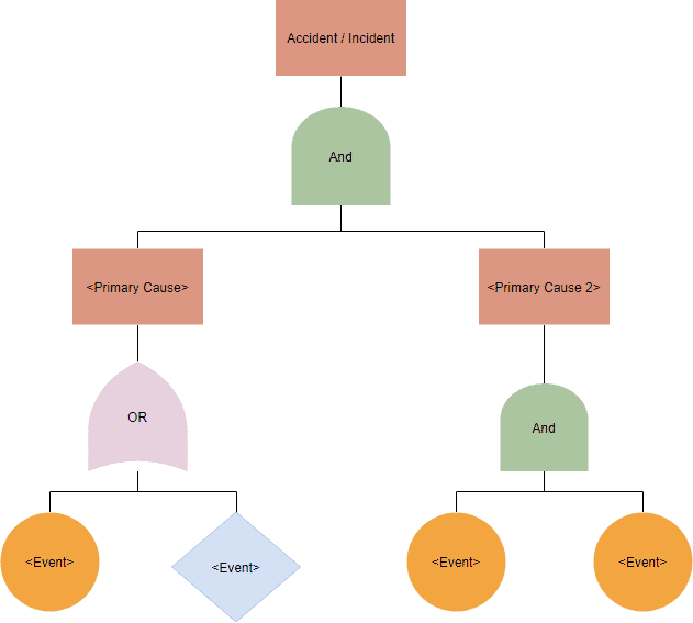
Fault tree analysis is an analytical method used to examine the causal factors leading to an undesirable event, by connecting various events through logical symbols to form a tree diagram. This method was developed by the Bell telephone laboratories in the 1960s. Both qualitative and quantitative methods are used to identify the main cause of the problem. The top event in this diagram is formed top down, with causal events leading the way downward. Events and gates are the fundamental figures in the fault tree diagram. Events are deemed to have reached a state when they satisfy the requirements imposed by a gate. The fault tree is made of events that include Top events and intermediate events represented in a rectangle, Basic events represented in a circle and non-basic events represented in a diamond. The logical symbols used to connect events mainly include AND gates & OR gates.
Advantages: Identifies multiple contributing causes.
Disadvantages: This is a time-consuming process where computer algorithms are needed to accomplish the analysis.
6. Failure Mode and Effect Criticality Analysis (FMECA)
Failure mode and effect analysis is a method used in reliability study. FMECA is used to identify probable failure modes for a product, process, or system; it also does a risk assessment and ranks the failure modes according to criticality. The US Military developed FMECA in 1949, under the name “Procedures for Performing a Failure Mode, Effects, and Criticality Analysis,” In order to enhance and record the dependability of the hardware utilized in the space program, and NASA formally developed it further in the 1960s.
Once the failure modes that are judged to be the most critical have been identified, the corrective actions will be implemented, thus achieving improvement in the performance of the production cycle and reducing overall risk level. The criticality is rated based on the failure modes’ likelihood of occurring, the severity of effect of failure, and the likelihood of being able to identify a failure before it becomes critical. A low severity score suggests that the failure is not particularly serious. A low score on Occurrence would imply that the event is not likely to occur. A low detection score would suggest that there is a high probability of detection if the event happens. Based on the values of severity, occurrence and detection, a Risk Priority Number (RPN) can be generated. This is how RPN is computed: RPN = Occurrence x Severity x Detection
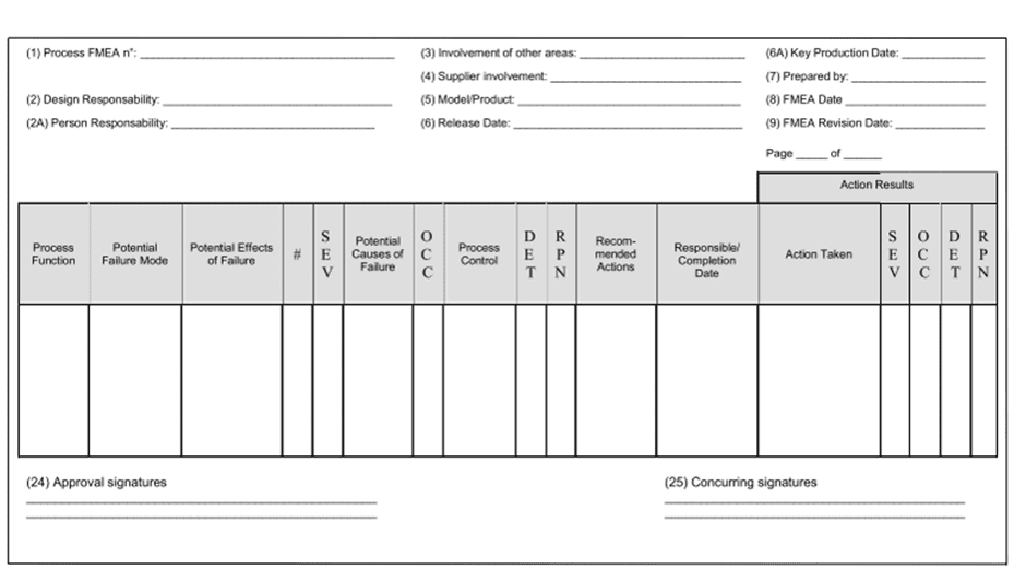
Here, the process function, failure type, potential impact, severity – score (SEV), potential cause, frequency of likelihood to occur (OCC) – score, how easy to detect (DET) – score are represented and the risk priority number is calculated as follows: – SEV x OCC x DET = RPN. Then necessary corrective actions are taken as per result.
Advantages: Its comprehensive, systematic establishment of relationships between failure causes and effects, and its ability to point out individual failure modes for corrective action in design.
Disadvantages: Extensive labour required, a large number of trivial cases considered, and inability to deal with multiple-failure scenarios or unplanned cross-system effects.
7. Affinity Diagram
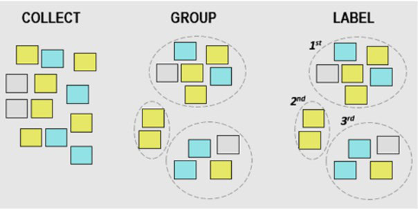
Fig: Illustration of Affinity Diagram
A tool for classifying and organizing information, concepts, or problems according to their connections or resemblances. It can assist you in finding themes, patterns, and classifications in a lot of data, such as the results of a brainstorming session. By dividing a complicated issue into smaller, more manageable issues and identifying its underlying causes, an affinity diagram may also assist you in organizing and prioritizing your problem-solving approach
When doing RCA, it is used to arrange and examine the reasons behind an issue, enabling you to spot trends, patterns, and connections between them. An affinity diagram, which provides a visual representation of your conclusions and suggestions, may also help in communicating and presenting the outcomes of your RCA.
Advantages: Understanding and awareness of the issue and its causes can be improved by breaking down a big, complex problem into smaller, more manageable components. Disadvantages: This is formed through a brainstorming process. It is also a time-consuming process, resource-intensive, subjective inconsistent, and incomplete or inaccurate.
Conclusion
As a scientific and methodical approach to problem-solving, RCA offers a structured pathway to identify and address the underlying causes. RCA enables organizations to uncover the fundamental issues that give rise to failures, defects, and inefficiencies. In conclusion, Root Cause Analysis along with corrective and preventive action stands as a fundamental tool for excellence in quality, safety, and operational efficiency.